Door op “Accepteren” te klikken, ga je akkoord met het opslaan van cookies op je apparaat. Bekijk ons Privacy beleid voor meer informatie.
Onze release notes zijn alleen beschikbaar in het Engels. Als iets onduidelijk is, neem dan contact met ons op via +31 73 204 8800.

Release notes

Blijf op de hoogte van onze maandelijkse releases!

A rebuilt list widget

The list widget is one of the places you spend the most time, but getting its columns to sit right has never been much fun. Setting a column's width meant dragging it to size by hand, which was fussier than it should have been, and on a busy dashboard a column could end up too narrow to read.

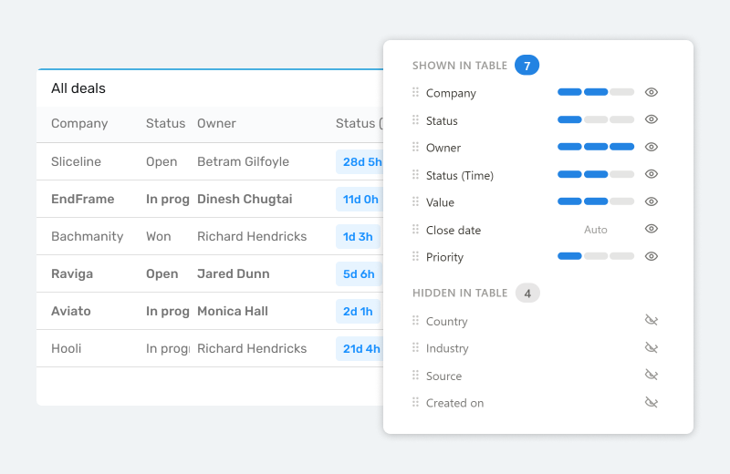
New list widgets are now built on the same list experience you already know from the portal and the item modal. Every column keeps a sensible minimum width, and rather than chasing an exact pixel width you set how much relative space each one takes: 1, 2 or 3. When the columns don't all fit, the list scrolls sideways instead of squeezing them, so a wide list on a narrow dashboard tile stays readable.

One thing worth knowing: your existing list widgets keep working exactly as they do today. The new experience applies to the list widgets you create from here on, so nothing shifts under you and there's nothing you need to migrate. It also brings a completely new way to choose and order your columns, which is worth its own section.

Columns hold a minimum width and scroll rather than getting squeezed.

A better column picker

Deciding which columns a list shows, and in what order, used to get painful the moment an object had a lot of fields. Hiding a field meant dragging it all the way to the top, which is close to impossible when there are dozens of them, and there was no quick way to find the one you were after.

The new column picker makes that quick. Each field now has an eye: click it to show or hide the column, so tidying up a list is a single click instead of a long drag. Reordering by drag and drop has been refined so it behaves the way you expect, and you can search your fields by name to jump straight to the ones you want. The width selector is clearer about what it actually does. A list shows up to 12 columns for now, and if that turns out to be too few, tell us and we'll look at raising it.

On an object with 50+ fields, building the exact view you want, say a support list with subject, status, assignee and due date, is now a matter of a search and a few clicks rather than a lot of dragging. How to use it? Add a new list widget and open its column settings.

Show or hide with the eye, reorder by drag, and search to find a field fast.

🦋 Improvements

  • Improved performance during overnight hours (Amsterdam time), so teams working in other time zones or the early hours get a smoother experience.

🪲 Bug fixes

  • Column ordering for Time in choice is now included when you share a dashboard template.
  • You can now paste a value into a numeric field with Ctrl+V.