May 2026
Criteria builder grouping & OR, multiple roles & a lot more
Grouping and the OR operator in the criteria builder
The criteria builder has been part of VobeSoft since the very beginning, and you use it everywhere: lists, conditional logic, role access, notifications, etc. But it has always had two limits that forced awkward workarounds. You could only chain conditions with AND, and there was no way to group them. If you needed "this OR that," you were stuck with a clumsy NOT EQUAL TO trick that never quite did the job.
Now you can add the OR operator and decide per group whether its conditions are matched with AND or OR. You can also nest groups up to two levels deep, which covers every scenario we could think of. Find one it doesn't? Let us know and we'll add another level. So genuinely complex logic finally has a home: "show leads assigned to me that are either overdue, or high-value and still open." Everything you already rely on stays put.

And because the criteria builder is used throughout VobeSoft, every place can now get that much-needed rebuild (so you can finally get rid of that NOT EQUAL TO chain).
Assign multiple roles to a user
Until now, a user could have exactly one role. In practice, people don't fit into one box. Administrators kept hitting the same wall: someone works in both support and finance, so you build a "Support & Finance" combination role. With two roles that's annoying, since every change means editing both. With users who wear four or five hats, the number of combination roles you'd need, and the number you have to update whenever something changes, gets out of hand fast.
Now you can assign as many roles to a user as you need, and their permissions are simply added together. A user with a role that can edit subject and assigned, plus a role that can edit description and due date, can edit all four.

The real payoff is that you can build small, specific roles and combine them. Say a salesperson, a marketer, and a developer all join the working group for an audit. Create one Audit role with the right access and hand it to each of them on top of their existing team role. Before, you'd have had to build three more roles, Sales Audit, Marketing Audit and Development Audit, just to avoid stripping away their day-job rights. Now you grant the team role and the audit role, and you're done.
A redesigned file previewer
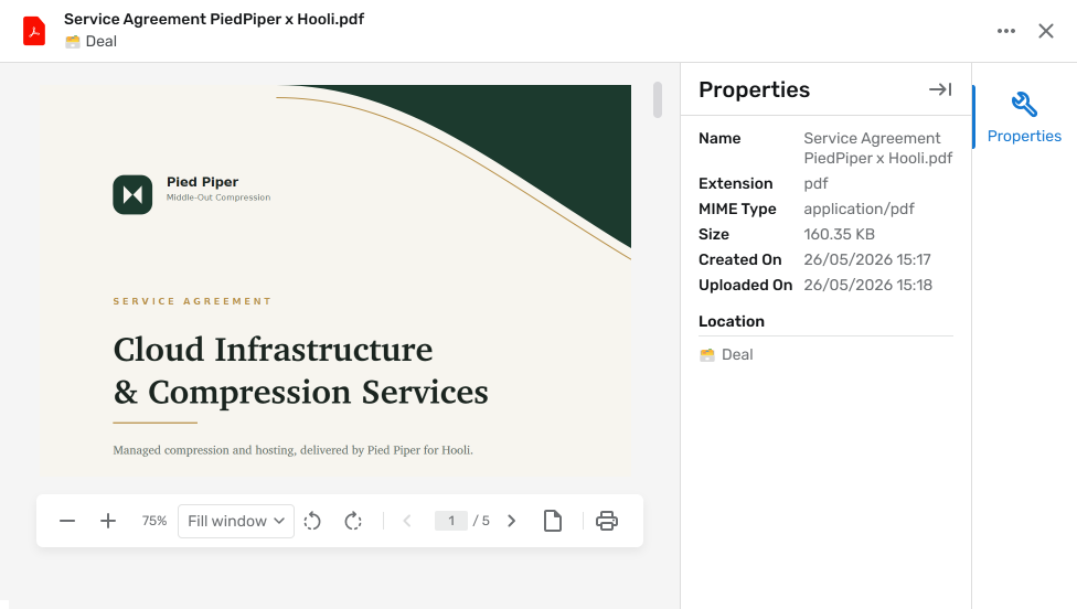
The file previewer has a fresh design that's easier to read, shows more useful information about the file you're looking at, and gives you more control while you view. We've also rebuilt its foundation to be future-proof, because this is the groundwork for what's coming next: a full document management system with proofing and annotation. We wanted to get the new previewer in your hands now, and we'll have more to show you soon about where it's heading.
See how long an item has been in a choice
Activate Time in choice on a choice field and you'll see how long each item has sat in its current choice. This is especially handy when your choice field acts as a status, like open, in progress, closed, because you can immediately spot the ticket that's been "in progress" for three weeks. It works just as well for longer workflows with ten or more steps, giving you a clear read on where things are getting stuck.

🦋 Improvements
- Choice fields can now show, hide or set a default choice based on the value of another choice field, handy for things like surfacing only the sub-categories that belong to a selected main category. For now it keys off a single choice field.
- You can now filter a user account field by role, so it only shows the relevant people (for example only the finance team) instead of your entire user list.
- Two items of the same object can now be merged, with a side-by-side view of the differences and a way to resolve any conflicts.
- A user account field can now act as the recipient of a notification, making who gets notified dynamic per item.
- You can now see the last login date for each user.
- Portal users now see the dynamic title of a connected item rather than a raw reference.
- Deleted items are now soft deleted, so an accidental deletion can be recovered instead of being gone for good.
- Significantly improved performance across the settings page, items, lists, and conditional logic.
🪲 Bug fixes
- The file preview now opens correctly when you have multiple file tabs open.
- Mirror field values are now included when you export.
- Flat lists can now make use of conditional logic.
- Users with multiple roles no longer get duplicate dashboards.
- Files with an uppercase file extension can now be uploaded.
- Closing an item tab now returns you to the previous tab instead of the first one.